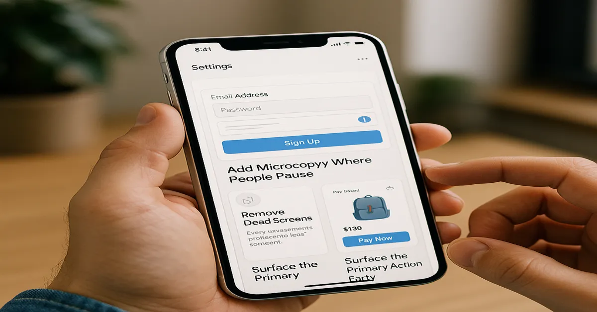
Users don’t give feedback on bad UX. They just disappear.
No angry reviews. No long emails. Just quiet churn. One confusing screen, one missed tap, one dead-end flow—and they’re gone.
The good news? Most of what drives users away isn’t a broken app. It’s tiny things. An unlabeled button. A missing confirmation. A screen that leads nowhere.
You don’t need a full redesign to improve your product. You just need to notice what’s already costing you users—and fix it.
The changes in this piece are small. But the impact isn’t.
Remove Dead Screens
Every extra screen is a chance to lose someone.
Dead screens—those with no clear purpose or next step—act like speed bumps. They slow down momentum and force users to think harder than they should.
You’ve seen them: “Settings” pages with no real settings. “Help” screens that lead nowhere. Empty states that do nothing but take up space.
Trim them. Merge them. Or make them useful. Every screen should do one of three things—inform, guide, or prompt action. If it doesn’t, it shouldn’t exist.
Apps that feel fast often aren’t faster. They’re just leaner. No waste. No filler.
Add Microcopy Where People Pause
Users rarely get stuck because your app is broken. They get stuck because it’s silent.
When people hesitate—on a form, during checkout, at signup—it’s usually because they don’t know what to do next or what’s expected. That’s where microcopy saves the experience.
A short line under a field. A quick note clarifying what happens next. A subtle reassurance during a sensitive step. These aren’t features. But they stop confusion before it starts.
The best microcopy disappears into the flow. You barely notice it—but without it, the drop-off rate spikes.
Good UX talks. And it talks exactly where users pause.
Surface the Primary Action Early
Users don’t scroll to find meaning. They scan for it. Fast.
If the main action—book, order, send, upload—sits halfway down the screen or hides behind a menu, you’ve already lost attention.
Apps that convert well make their purpose instantly clear. No guessing. No hunting. The moment a user opens the app, the core action should be visible, tappable, and obvious.
Burying it behind layers doesn’t make your app feel more “complete.” It just makes it harder to use.
Design isn’t just what looks good. It’s what shows up at the exact moment a user needs it.
Make Error States Human
Something went wrong. That’s fine. Just don’t say it like a machine.
Default error messages—“Invalid input”, “An error occurred”, “Please try again later”—aren’t just vague. They’re frustrating. They tell users nothing and leave them stuck.
Good error states are clear, helpful, and human. They explain what went wrong, why it matters, and what the user can do about it. Bonus if they do it with a little warmth.
No one expects perfection. But when things break, your app’s tone decides whether users leave annoyed—or try again.
Empathy isn’t a feature. It’s UX.
Confusing navigation doesn’t always look broken. It just feels like work.
Too many categories. Too many taps. Too many dead ends. All of it adds up to friction. And friction costs attention.
Every screen should help users move forward—fast. If they have to stop and think where to go next, your structure needs work. Fewer steps. Clear labels. Logical grouping. That’s the fix.
It’s why experienced teams—whether in New York, Chicago, or mobile app developers in Houston—spend as much time refining flows as they do building features.
Great navigation doesn’t just guide. It disappears.
Use Feedback for Every Touch
Taps, swipes, uploads—every action needs a response.
If users press a button and nothing happens, even for a second, they assume the app is frozen. That’s all it takes to break flow and lose trust.
Feedback doesn’t have to be loud. A subtle animation. A quick vibration. A loading state that says, “We’ve got it.” These tiny signals reassure users that their input registered—and the app is working.
Without feedback, your app feels unresponsive. With it, everything feels faster, smoother, and more intentional.
Invisible friction is still friction. Your job is to make it disappear.
Reduce Cognitive Load
If users have to think too much, they’ll quit.
Too many options, complex instructions, or inconsistent UI patterns force the brain to work harder than it should. The goal isn’t to dumb things down—it’s to make every action feel obvious.
Clarity isn’t optional. It’s usability.
Respect the Empty State
An empty screen is an opportunity. Not a placeholder.
When there’s no content—no messages, no bookings, no data—don’t leave users with silence. Show them what they can do next. Set expectations. Offer examples. Create momentum.
The worst empty state is one that says nothing.
Design for One-Hand Use
Not everyone uses your app sitting still.
If your primary action is buried in the top-right corner, you’re ignoring how people actually hold their phones. Especially on larger screens, thumb-friendly design isn’t a detail—it’s the difference between flow and friction.
Design should fit behavior. Not fight it.
Simplify Forms Ruthlessly
Forms are where most apps lose users.
Too many fields. Too many steps. Too much effort. The result? Drop-offs no amount of retargeting can fix.
Ask only what’s essential. Break long forms into smaller steps. Use autofill, smart defaults, and clear labels. Every second you save users earns you trust.
A form should feel like a quick task—not a chore.
Final Thoughts
Good UX isn’t always about sweeping changes. Often, it’s the small things—the missing label, the clunky flow, the silent tap—that drive users away.
The fixes in this article don’t require a redesign. They require awareness. And a willingness to look at the product the way a new user would.
Whether you’re refining in-house or working with a mobile app development company in Houston or elsewhere, the goal is the same: make every interaction count.
Because users rarely notice great UX. But they always feel it.

