
Knowing how price behaves is essential. Equally important is knowing where price is behaving — which sectors are active, and how different parts of the market respond. That’s where the heatmap becomes valuable, not by replacing your indicators or charts, but by adding another layer of understanding that often gets missed.
It shifts your focus from one stock to the environment around it. This perspective often reveals things traditional technical analysis doesn’t.
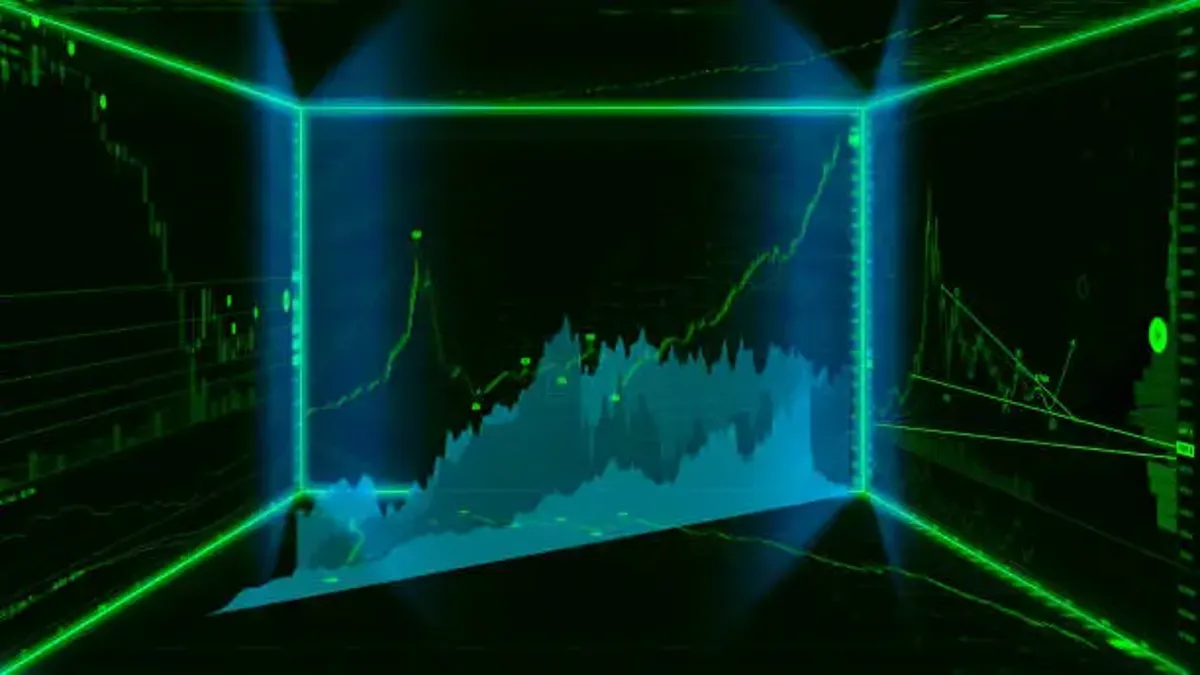
How the Heatmap Fits into Technical Workflows
Charts help traders understand market behavior over time. They reveal patterns, measure momentum, show volume shifts, and highlight areas where price has previously reversed or consolidated. This is the foundation of technical work.
What the stock heatmap adds is a structural overview. It shows you where attention is concentrated, and whether that attention is isolated or part of a broader trend. A breakout on a chart means one thing. But if that breakout is happening alongside strength across the same sector, it becomes part of something larger.
You don’t just see a setup, you understand where it fits.
This is especially important when multiple setups are competing for your attention. Let’s say two different stocks are showing bullish breakouts. Without context, you might choose randomly between them. But if one belongs to a sector showing clear green momentum across the map, while the other is surrounded by weakness, your decision becomes easier. The heatmap doesn’t decide for you; it gives your choice more weight.
Sector Relationships That Charts Alone Can’t Show
Some movements don’t begin with headlines or trendlines. They begin quietly, as groups of stocks within a sector start to shift. One turns green, then two, then a block of them. This isn’t always visible on an index chart.
Suppose you see consistent improvement in industrials, materials, and energy stocks over a few days. That alignment might reflect more than coincidence. It could suggest shifting expectations around future growth or changes in policy direction.
You won’t always know the reason. But the alignment itself is the signal.
Why the Stock Market Map Enhances Strategic Decision-Making
A stock market map isn’t just a visual. It’s a filter. It helps you move faster by showing you which areas of the market deserve your attention. This is especially useful when building a watchlist or narrowing down a long scanner result.
Instead of starting from scratch daily, you look at the map and see which sectors are moving together, and which names stand out. That shortens the time between idea and analysis, without cutting corners.
When the SP500 Heatmap Offers More Than Numbers
With so many components from different sectors, the SP500 heatmap becomes a map of market dynamics. You’re not watching charts one by one. You’re seeing how sectors behave about each other, which gives clues about what kind of market we’re in.
If defensive names hold steady while growth stocks lose traction, that tells you about risk appetite. If semiconductors light up while utilities fade, the story changes. This is how traders begin to anticipate change, not through predictions, but by watching how behavior evolves.
What the Heatmap Adds to a Technical Trader’s Edge
Technical setups don’t exist in a vacuum. They gain strength or fail based on market context. The heatmap gives you that context before you even open the chart.
When backed by similar strength across related names, a clean pattern looks much more promising. Conversely, a technically valid setup may be worth skipping if the rest of its sector is showing weakness. This is how the best traders filter noise and avoid isolated trades that go nowhere.